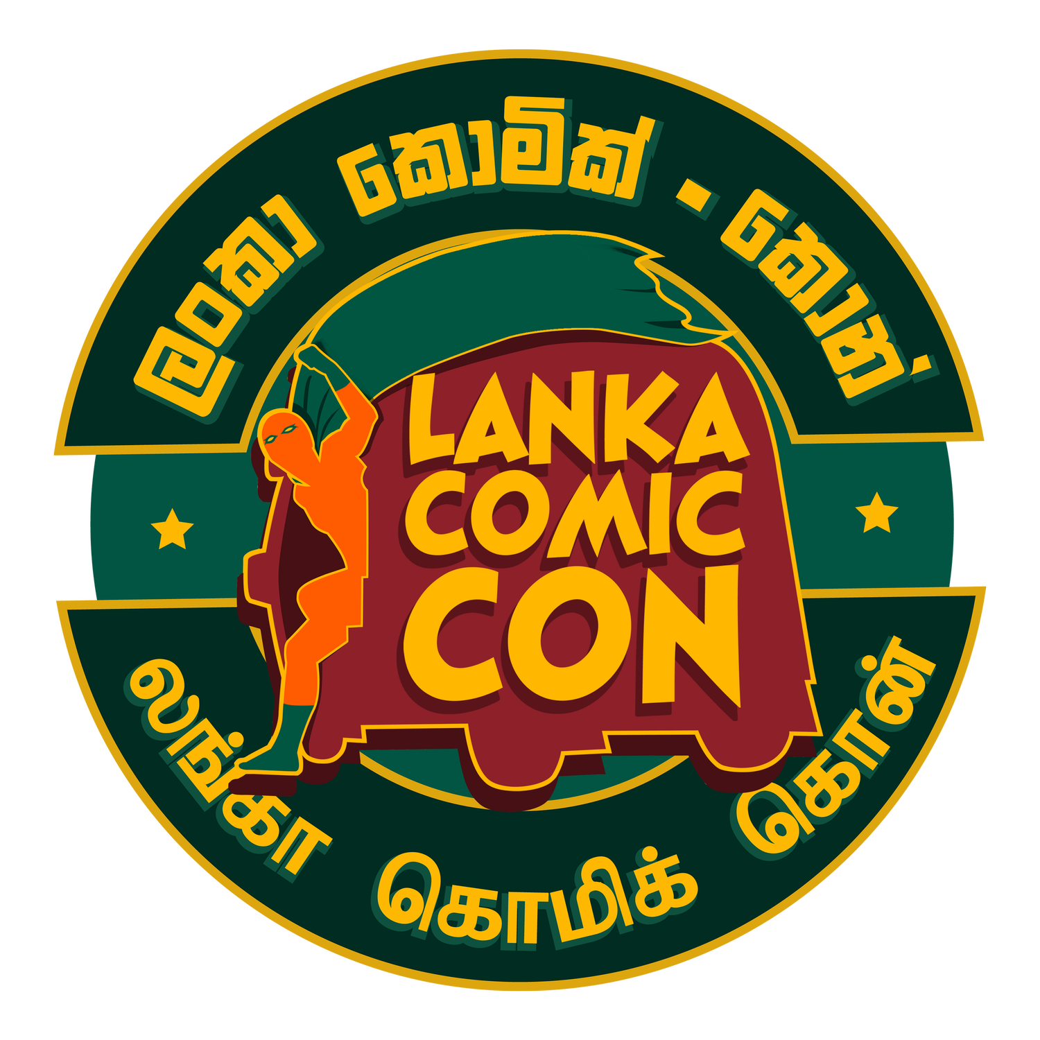
Last year we held a logo competition, for Lanka Comic Con 2016. We were so pleased with Akila Weerasinghe's entry, we decided to make it an official logo for Lanka Comic Con, period.
I talked to Akila about "Tuk Tuk Man," and how he came up with the design.
"Firstly," he said, "this was an event celebrating things that I hold so dear, I wanted to try and make some contribution. Secondly, I was just stepping out as a designer and wanted more exposure."
Akila wanted to make the logo feel truly Sri Lankan, one people could look at and immediately see a connection. Like so many Sri Lankans, Akila grew up abroad, and the Tuk Tuk was always part and parcel of visits home.
“I looked towards something I loved about Sri Lanka from my times spent here. Tuk-tuk, three wheeler, trishaw, whatever you wanna call it, was definitely something Sri Lankan.”
Version 1
His ever-supportive mother suggested he ditch his more complicated initial design, for plain colored, silhouettes:
Version 2
Later, his friend Sinthujan suggested adding boots, gloves, and an eye mask to bring out the superhero in the character. This design is what won the competition.
Version 3
Finally, after consulting with the Comic Con team, Akila changed the font and made the colors match the national flag.
An Early Calling
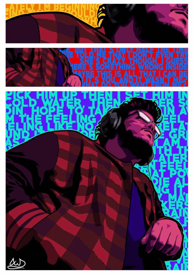
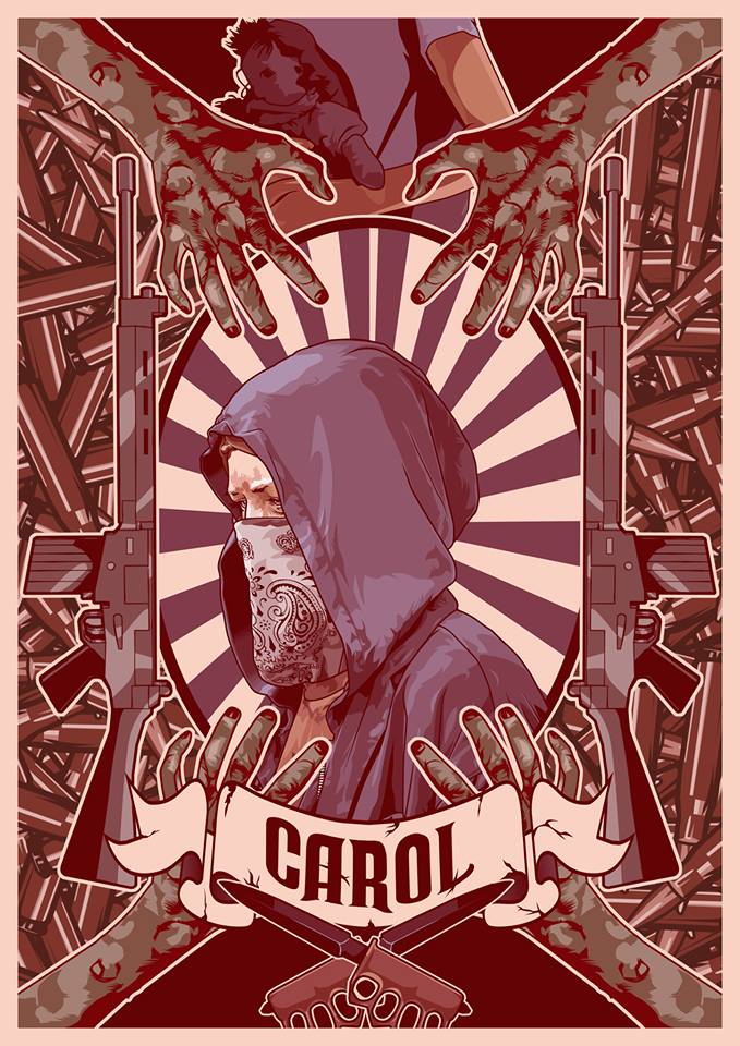
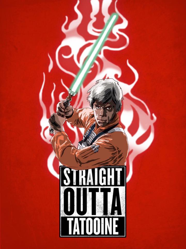
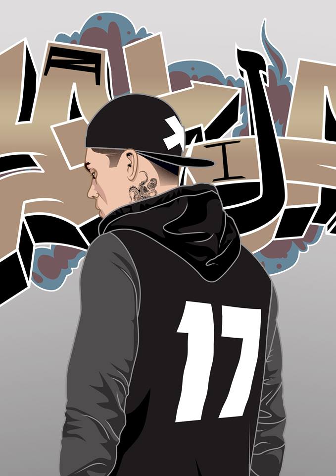
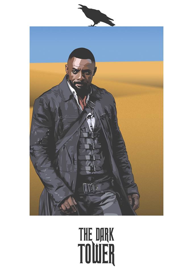
Since early childhood, Akila has been drawing. His parents encouraged him and sent him for art classes, where his interests broadened. Pencil portraits, watercolor landscapes, even pen and marker to graffiti.
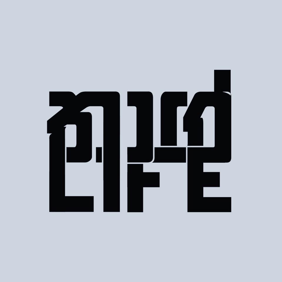
For the past four years Akila has worked in digital illustration and design. What started as a university pastime, has grown considerably. To see more of his work or for commissions, you can contact Akila on his page.
